We humans are creatures of habit, and our favorite apps are part of our daily routine. When something we know well suddenly looks or works differently, it triggers all our survival instincts: loss aversion, fear of extra work, and just plain annoyance. Psychologically, this is normal. We rely on muscle memory (that old Slack shortcut!) and sunk costs (months of learning a product) and we instinctively defend the status quo. People hate feeling like they have to “waste” effort re-learning. We also spot downsides faster than upsides – negativity bias means users obsess over the annoying new bug or hidden button far more than they’ll celebrate that shiny feature.
Over time, people memorize where things live. If you shuffle menus or buttons (even with good intentions), it breaks that mental map. For instance, when Slack introduced a major new sidebar with collapsed sections and a ton of white space, many users complained it “hid” channels and made navigation three clicks away. They weren’t wrong – their habits were upended. Users have invested time learning the old interface. Any change feels like wasting that knowledge. The more complex the tool, the deeper the learning curve; power-users often feel especially protective. Veteran Basecamp users, for example, rely on its simple three-pane design. If Basecamp were to radically rebuild its interface overnight, even its loyal fanbase might bristle – because they’ve already paid the “training cost.”
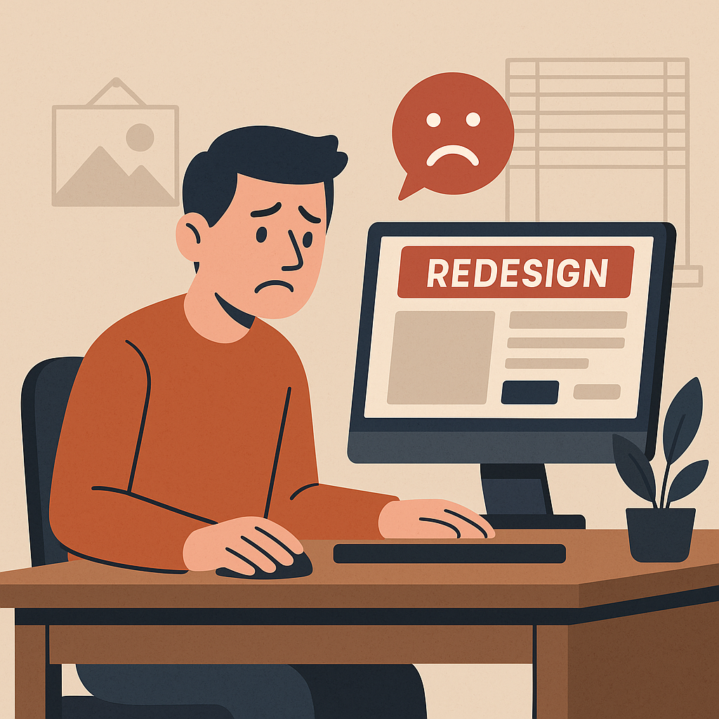
Change often looks scary. People jump to “new = harder,” even if it’s better in the long run. A redesign feels like a pop quiz they didn’t study for. (That’s why so many gripes about new designs focus on eye candy and “busy” layouts.) That’s also why Slack’s 2023 redesign – which stuffed chats, threads, and notifications into ambiguous “Home” and “Activity” sections – went over poorly. Users felt the new nav was more confusing, not simpler. We hate losing what we know even more than we like gaining the same thing. A user might grudgingly agree the new dark theme “looks nice,” but they’ll still complain if it means a momentary struggle to find the search bar. The mind hones in on everything lost or new friction. For SaaS apps, even small layout shifts trigger this: a button move or color swap can inspire a disproportionate outcry.
People often reject change not out of stubbornness, but out of self-protection. They’ve built a comfort zone in your app, and any big shift feels like a bet on an unknown. Real-world examples abound: Slack’s most recent overhaul tried to declutter, but power users objected that it hid essential info behind vague tabs. (Those users just saw their carefully organized channels vanish into “Activity” – automatically triggering instinctive panic.) By contrast, when Basecamp has adjusted its UI over the years, they’ve done it so gradually and transparently that it rarely makes headlines. The lesson? Whenever possible, treat users as partners: explain why you think a change helps, involve them early, and never underestimate how attached they are to the current version of “their” app.
How to Manage Transitions and Mitigate Backlash
Changing your app doesn’t have to ignite a riot. Indie developers and small SaaS teams have a powerful advantage: agility and closeness to users. Use it. Here are proven tactics to make updates smoother, with the psychology in mind:
Soft Launches & Phased Rollouts
Don’t flip a switch for everyone at once. Try new features internally or with a small beta group first. For example, let your own team or a handful of friendly clients use the update in “incognito” before a general release. This helps catch confusing spots early (and prevents embarrassing full-blown meltdowns). Soft rollouts also build user goodwill: fans love feeling like VIP insiders. Many successful SaaS products follow this pattern – quietly testing changes with 5–10% of users, ironing out pain points before the big reveal. It creates a buffer where you can fine-tune without panic.
Opt-In Betas & Version Toggles
Give users control. Let them say “yes” or “no” to the new version on their own terms. Offer a banner or setting like “Try the new app preview” (or conversely, an “I prefer classic” toggle). That way, power users who thrive on the old way can stick with it a little longer, while curious folks can volunteer to test. For instance, Codeship (a devops SaaS) rolled out a UI redo with an opt-out switch for the first two months. They gathered feedback from both groups, fixed glaring issues, and only then turned off the toggle. This approach eases fears and provides concrete data on who likes or hates the change. It takes extra work, but nothing defuses backlash like giving people a choice.
Clear Communication & Storytelling
Users hate feeling blindsided. Before (and after) a change, explain the “why”. Write a friendly blog post, send an announcement email, or show an in-app note explaining what’s new and why it matters. Emphasize benefits in their language (“Spend less time searching for messages” or “Speedy new dashboard for faster insights”). Frame it as an improvement story rather than a mystery. For example, one startup transitioning from Slack to Basecamp told their team why the switch would solve specific pain points (lost tasks in chat, no ticketing). The team accepted the change because they saw the logic. Try doing short walk-through videos or “what’s new” tours too. When people understand the goal (and see screenshots), it lowers anxiety.
A quick tutorial can turn confusion into confidence. If your redesign significantly shifts workflows, consider adding an optional guided tour or tooltip hints on first launch. Highlight the major changes (buttons moved, new tabs, etc.) with short, friendly pointers. Many apps succeed with a “first-run” overlay that says, “Hey, new inbox page here!” or “Tip: Try this faster way.” These gentle walkthroughs reassure users that they won’t be left completely in the dark.
Collect Early Feedback Relentlessly
Set up channels to hear from users immediately after release. A simple feedback form, a pop-up survey, or even a monitoring channel (e.g. a Slack group or forum thread) can reveal frustrations in real time. Engage with the feedback – even negative reactions – and thank people for it. When users feel heard (“Yes, we know the button’s missing and we’re fixing it!”), they calm down faster. Early on, prioritize quick fixes for any showstopper issues. As Codeship’s team found, gathering qualitative and quantitative feedback during the rollout lets you address deal-breakers early and show goodwill (“You asked, we acted”).
Whenever possible, show data or concrete reasons to love the change. If a new feature makes a task 50% faster, shout that out. If the interface is more accessible or mobile-friendly, mention it. Use actual examples (e.g. “No more scrolling 100 messages!” or “Search runs in 2 seconds instead of 6”). This tech-centric audience craves evidence. A dashboard graph or a simple before/after screenshot in your update notes can go a long way.
Provide Support & Resources: Assume some users will struggle. Preempt frustration by updating your Help docs, FAQs, and tutorial videos to match the new design. Offer a live Q&A in your forum or a webinar demo for major changes. Quick, personal support (even just empathetic replies to angry posts) can convert haters into advocates. In short, be the opposite of an unhelpful corporate bot: be human, responsive, and patient. A friendly reply like “Oh man, sorry that threw you off – let me show you a quick fix!” shows empathy.
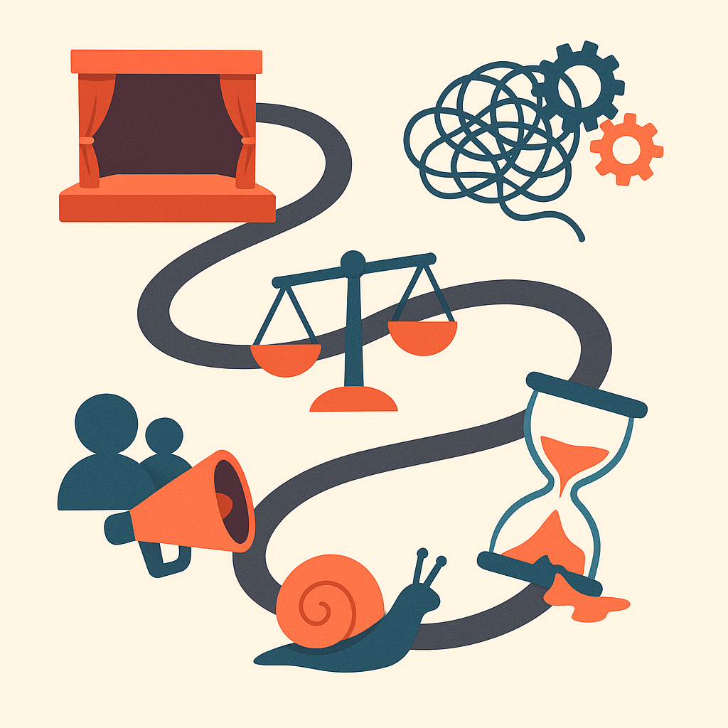
Each of these tactics addresses the core fears. Rolling out changes gently and transparently gives users a sense of control (and preserves goodwill). It doesn’t mean skimping on innovation – just that you marry your improvements to user empathy. Indie developers may lack huge QA teams, but they can leverage open communication and flexibility. When in doubt, remember: a user who feels guided through the update is far more likely to stick around, even if the changes are big.
Famous Redesign Fails and Lessons Learned
Even giant companies with tons of resources have tripped up. The social-news site launched “Digg v4,” a complete revamp that removed many cherished features (the bury button, power-user tools) and was riddled with bugs. Loyal “Digg Nation” users felt alienated and frustrated – traffic plunged by about 30%. Lesson: Don’t throw out the baby with the bathwater. Radical overhauls can punish your core users. Instead, iterate gradually and safeguard beloved functionality. Test heavy beta cycles for big moves.
Snapchat reorganized its chat and “Discover” screens, separating friends’ stories from celebrities/publishers. The result? Confusion and outcry. High-profile celebs (Kylie Jenner and others) slammed the new layout as “so sad,” even starting an online petition (1.2+ million signers) to revert. Snap eventually partly backed off by merging friend stories back in. Lesson: Listen to your passionate users quickly. On mobile apps especially, UI shifts can completely distort how people navigate. This could have been smoother with an opt-in preview or incremental tweaks instead of an all-at-once flip.
In late 2016 Twitter began defaulting users to an algorithmic “Top Tweets” feed instead of purely chronological. Users felt disoriented, missing posts from their own friends. After pushback, Twitter allowed an easy switch back to reverse chronology. More recently, Twitter’s abrupt rebrand to “X” (2023) – changing logos and removing the familiar bird – left many users feeling shocked and betrayed by an overnight change. Lesson: Core user control is sacred. Don’t force algorithmic rules or brand-identity switches without a clear opt-out or thorough warning. Gradual introduction and preserving familiar elements (even if just temporarily) can ease the transition.
The storied message-board gave its first major facelift, moving to a modern responsive design. Many longtime users decried the loss of custom subreddit styles, inline flairs, and the old ‘alien’ logo. The feeling was that communities lost a piece of their identity. As a result, thousands continued using the “old.reddit.com” view long after the upgrade. Lesson: Online communities prize customization. When redesigning, either preserve what makes each group unique or offer a gradual opt-in. Reddit took years to phase out old-style features. Indie SaaS with user-created content should tread lightly with global UI changes.
Slack rolled out a slick new navigation model, consolidating everything under Home, DMs, Activity, etc., to promote “focus.” But users immediately called it a step backward: important channels got buried, and lots of blank space meant “half the info I need is hidden.” Even tech CEOs joked on Twitter about the inefficiency. Slack defended the change as “organized,” but for many it felt disorienting. Lesson: Clarity > minimalism. If you group menus, label them clearly. User testing could have revealed that terms like “Activity” were too vague. Offering beta access (and the ability to revert) might have softened the blow.
Instagram’s shift from a strict chronological feed to an algorithm-driven feed changed the core experience. Users complained their favorite accounts were now hidden. (For extra flavor, that same era saw Instagram debut a bold new app icon and logo – many long-time users absolutely hated the sudden rainbow gradient, feeling it strayed too far from the familiar camera icon.) The timeline change was rolled out with promises to tweak algorithms, but no option to fully return to old behavior. Lesson: When a redesign affects how people see each other’s content (or your brand logo!), the resistance is intense. If you need to automate or optimize feeds, do it incrementally and consider giving power users an option to stick with the old view, at least at first.
Even Facebook has stumbled. In 2008 it unveiled a new “News Feed” home page that turned out to annoy millions – over 1.7 million users signed a “Petition Against the New Facebook.” The company quickly backpedaled on some changes to placate users. Ironically, as the years passed, nobody could agree on which old design was actually best. Lesson: With huge legacy products, any tweak will upset someone. Run A/B tests and honor feedback enough to justify the trust, but recognize you can’t please everyone. Sometimes the safest approach is a very gradual rollout with lots of user input.
A popular streaming app Spotify update hid familiar controls. Users discovered that the “repeat” and “like” buttons were tucked away in a menu instead of visible on the now-playing screen. The outcry was swift and vocal – many declared the new layout a downgrade. Within days, Spotify quietly restored the missing buttons after listening to user complaints. Lesson: Don’t bury frequently used features. If a change breaks muscle memory (especially for power features like repeat/shuffle), expect pushback. Test UI changes on target users, and if something feels less convenient, be ready to revert it.
Once the social network giant, MySpace tried numerous redesigns to stay cool – adding skeuomorphic textures, then later a very “black and gold” music-centric theme. Each time, users felt the site lost its quirky, user-driven style. While MySpace’s decline had many causes, every big overhaul accelerated user flight to Facebook. Lesson: If your audience is built around personal expression, heavy templating or forced "improvements" can kill the vibe. Let users personalize (or keep doing what they love) rather than pushing a one-size-fits-all makeover.
More recently, Tumblr introduced new content filters and UI tweaks that many creative bloggers disliked, calling the interface less intuitive and over-branded. Users complained it cluttered what was once a minimalist blogging playground. Tumblr has since rolled back some of those changes and focused on performance fixes instead. Lesson: Cultivate your core niche (in Tumblr’s case, fandom artists and writers). Radical redesigns in a niche community are risky. Sometimes stabilizing the existing experience is a safer bet than a flashy rewrite.
Each of these stories has the same moral: Users love feeling in control and fear losing what they’ve come to know. The common thread is that sudden, unexplained overhauls nearly always trigger a reaction. For an indie dev, this means plan your transitions like a movie director – tease the trailer, show behind-the-scenes, and give the audience a little time to applaud before changing the script. Keep communication open, let users ease into the new version, and be ready to fine-tune or roll back if something just doesn’t work for them. In the end, a design may be objectively better on paper, but if it makes your users feel lost, it’s not better for them.